Designing Lucky Duck: A Rewards Platform MVP as a Growth Function
Designing Lucky Duck: A Rewards Platform MVP as a Growth Function
The hard part of a rewards product isn’t building another marketplace. It’s building enough momentum that people actually come back. Lucky Duck is a clickable, mobile-first MVP concept for a consumer rewards & membership platform — designed and front-end engineered end-to-end to prove exactly that.
You can try the interactive prototype here. This post is the story behind it.
The Problem: Retention, Not Another Catalogue
It’s easy to draw a pile of pretty screens. It’s much harder to make a flow where every screen earns the next tap. A rewards product lives or dies on habit formation — so the design question isn’t “what does the catalogue look like?” but “what brings someone back tomorrow?”
So I refused to design disconnected screens. Instead, every screen had to map to a real growth loop.
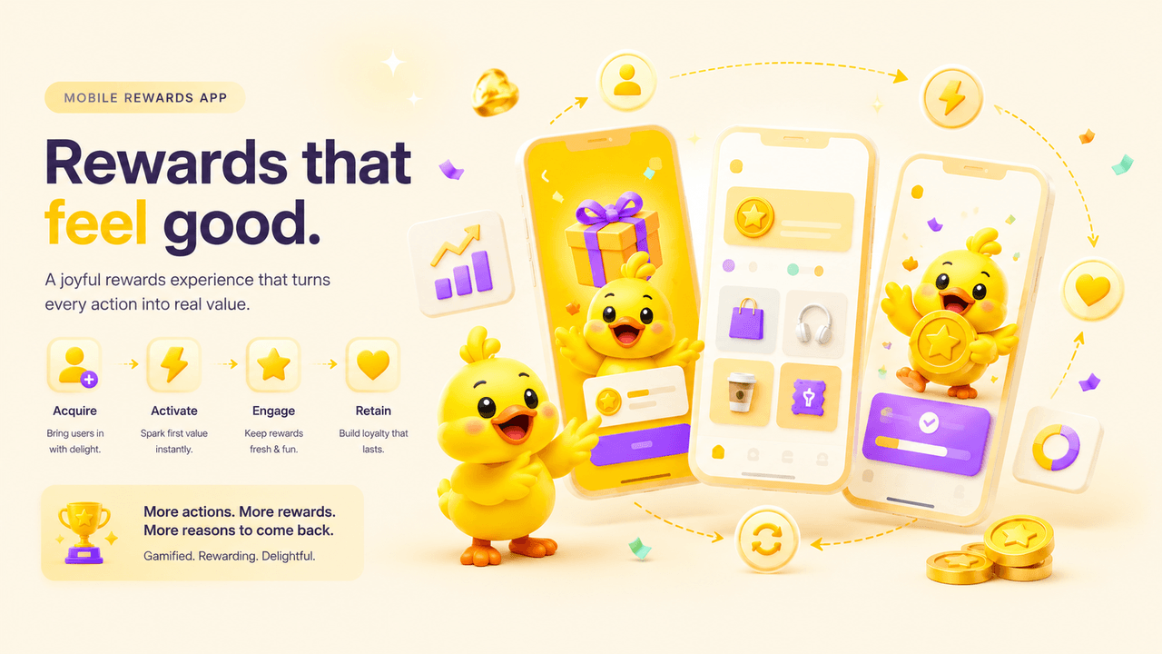
The Approach: Screens That Map to Loops
I structured the entire experience around four core loops:
- Acquisition — a bold, mascot-led landing that sells the promise in one line: Play More. Win More. Get More.
- Activation — low-friction signup that opens a credit wallet instantly, plus a one-tap wallet setup with bonus credits.
- Engagement — reward discovery with a featured deal, categories, and trending picks, each with transparent odds.
- Retention — a portfolio of collections, tiers, and recent wins that gives a reason to return.
And one moment that ties it together: a celebration — confetti and a mascot moment that makes every win feel earned.
When the screens map to loops, product design stops being a coat of paint and starts being a growth function.
The Design System: Tokens, Not One-Off Screens
A prototype that can’t scale isn’t proof of anything. So Lucky Duck runs on a small token set, not bespoke screens:
- Color — Primary Yellow (
#FFD600), Deep Purple (#6C3CFF), Success Green (#22C55E), and a dark surface palette, all expressed as a singlePaletteabstraction with light and dark variants. - Type — heavy display weights for the big moments, calm body copy for clarity.
- Components — buttons, pills, progress bars, and cards that get reused everywhere, so new features ship fast and stay on-brand.
Because the whole demo reads from one palette, light and dark stay in lockstep — change a token once and every screen follows.
The Build: A Prototype on the Real Stack
This isn’t a flat mockup. It’s a working prototype built on the exact stack the product would launch on:
- Astro for a fast static page,
- a React island for the interactive demo,
- Framer Motion for the screen transitions and the celebration,
- Tailwind CSS for the token-driven styling.
A couple of engineering details worth calling out:
- No theme flash. The demo island is mounted
client:onlyand reads the live theme on its first render, so dark-mode visitors never see a flash of the light palette. - A single source of truth for color. The screen state machine is driven by one
Paletteobject, so there’s no drift between light and dark. - Clean backend handoff. The front end is deliberately decoupled — the handoff for payments, credits, and the odds engine stays clean for a backend engineer to pick up.
Why It Works
A rewards product is a retention problem disguised as a catalogue problem. By mapping every screen to a growth loop, grounding the visuals in a reusable design system, and shipping a real clickable prototype, Lucky Duck demonstrates the product thinking and the engineering — not just a static idea.
👉 Open the interactive prototype → and toggle the site theme to see the light and dark design systems side by side.
Try the prototype
The full primary flow, right here — create an account, claim a reward, and watch it land in your portfolio. Toggle the site theme to see the light and dark design systems.