Designing Daily Tomato Todo: When the Todo List and the Timer Are One Product
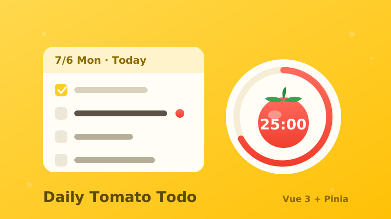
Designing Daily Tomato Todo: When the Todo List and the Timer Are One Product
Most todo apps treat time as a label and focus as an afterthought: tasks pile up in one endless list, and the Pomodoro timer lives in a corner you ignore. Daily Tomato Todo is a Vue 3 + Pinia daily planner built on a different premise — planning by day and focusing on one task should be the same motion, not two separate apps.
You can try the live app here and browse the code on GitHub. This post is the design story behind it.
The Problem: One Endless List, One Ignored Timer
A single scrolling list answers “what do I have to do?” but never “what am I doing today?” And a timer bolted onto a corner of the screen competes with the very list it is supposed to silence. The design question was never “how do I add a Pomodoro feature?” — it was “what does the app look like when the day, the task, and the focus session are one object?”
Four Decisions That Carry the Design
Everything in the app hangs on four decisions. Each one either removes a tap or removes a distraction.
1. The calendar hides behind the header date
No new button. The big date users already look at becomes the entry point: tap it and the full month unfolds. Small status dots summarize each day — open, overdue, all done — and every day is tappable, including empty ones, which simply render dimmer. Tap any date and the view travels there, ready for a new task.
2. The date chip follows the day you are viewing
The add bar carries a date chip whose default is always the day currently in view. Typing on tomorrow’s card creates tomorrow’s task — zero extra taps in the common case. Tapping the chip opens quick picks (today, tomorrow, next Monday) plus a full date picker for everything else.
3. One card per day, swipe to travel
The list is a horizontal rail of day cards built on plain CSS scroll-snap — zero dependencies, native inertia, days generated on demand. Day pills light up with the scroll position, and leaving today reveals a back-to-today shortcut. Filters apply to the card you are on, not to some global soup.
4. Starting a Pomodoro takes over the whole screen
Press play on a task and a focus overlay covers everything: countdown, progress ring, task name, pause and stop. You cannot scroll the list. You cannot add tasks. Blocking distraction is the feature, not a limitation. When the tomato ends, a break screen takes over in a calmer green, then hands you back to the list.
The Boring Decisions That Matter
Three small product calls shaped the data model:
- Tasks without a date land on today. One simple rule beats a separate “unscheduled” bucket the user has to remember to check.
- Unfinished tasks do not auto-roll. They stay on their original day as an honest record, and today’s card shows a red prompt to move them over in one tap. The history stays truthful; the fix stays cheap.
- Due date and scheduled date are one concept. Two date fields on a personal todo item is a data model looking for a problem.
The Build: Small App, Real Architecture
- Vue 3 + Pinia, one store. The carousel’s scroll position, the header date, the day pills, and the calendar selection all read from and write to a single store — no event spaghetti between siblings.
- Calendar dots are derived state. Open, overdue, and all-done markers are computed from the same store that renders the cards, so the summary can never disagree with the detail.
- The Pomodoro is a state machine. Idle, focus, paused, break — rendered as a full-screen overlay with an SVG progress ring. Modeling pause explicitly (instead of hacking the interval) is what makes the overlay trustworthy.
- Zero-dependency carousel. CSS scroll-snap gives native swipe physics for free, and the scroll listener only does index math.
Why It Works
This project started years ago as my first Vue learning exercise. Rebuilding it with Vue 3 and Pinia was a deliberate exercise in restraint: the boldest feature is the one that removes options instead of adding them, and the cleverest code is the code that got deleted in favor of a CSS property. Small product, real product thinking.
👉 Open the live app → and press play on a task to feel the full-screen focus mode.